
The Principal Component Analysis (PCA) is equivalent to fitting an n-dimensional ellipsoid to the data, where the eigenvectors of the covariance matrix of the data set are the axes of the ellipsoid. The eigenvalues represent the distribution of the variance among each of the eigenvectors. To understand the method, it is helpful to know something about matrix algebra, eigenvectors, and eigenvalues. Here is a n=2 dimensional example to perform a PCA without the use of the NumPy function pca, but with the function of eig for the calculation of eigenvectors and eigenvalues.
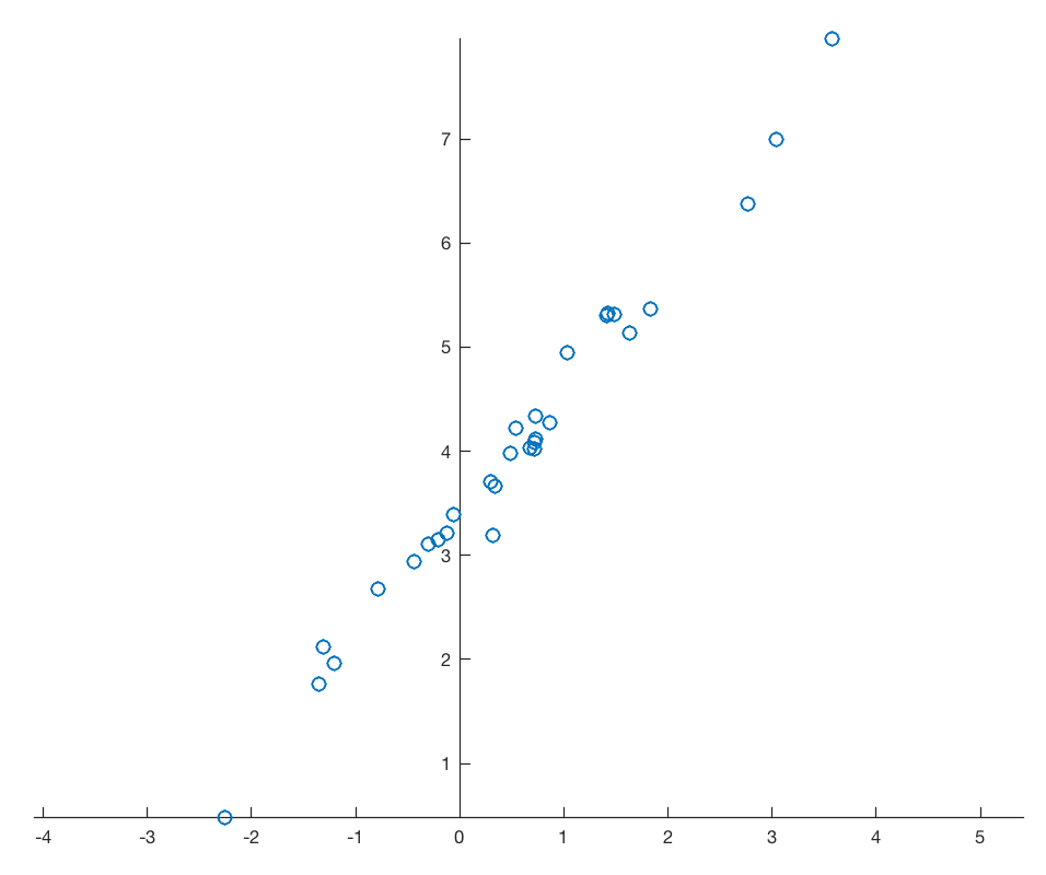
Assume a data set that consists of measurements of p variables on n samples, stored in an n-by-p array. As an example we are creating a bivariate data set of two vectors, 30 data points each, with a strong linear correlation, overlain by normally distributed noise.
import numpy as np
import numpy.linalg as linalg
from matplotlib import cm
import matplotlib.pyplot as plt
from numpy.random import default_rng
from sklearn.decomposition import PCA

rng = default_rng(0)
data = rng.standard_normal((30,2))
data[:,1] = 3.4 + 1.2*data[:,0]
data[:,1] = data[:,1] + \
0.2*rng.standard_normal(np.shape(data[:,1]))

plt.figure()
plt.plot(data[:,0],data[:,1],
marker='o',
linestyle='none')
ax = plt.gca()
ax.spines['top'].set_color('none')
ax.spines['right'].set_color('none')
ax.spines['left'].set_position('zero')
ax.spines['bottom'].set_position('zero')
plt.axis(np.array([-3,2,0,6]))
plt.xlabel('x-value')
plt.ylabel('y-value')
plt.show()
The task is to find the unit vector pointing into the direction with the largest variance within the bivariate data set data. The solution of this problem is to calculate the largest eigenvalue D of the covariance matrix C and the corresponding eigenvector V
C * V = D * V
where
C = data’ * data
which is equivalent to
(C – D * E) V = 0
where E is the identity matrix, which is a classic eigenvalue problem: it is a linear system of equations with the eigenvectors V as the solution.
Step 1
First we have to mean center the data, i.e. subtract the univariate means from the two columns, i.e. the two variables of data. In the following steps we therefore study the deviations from the mean(s) only.
data[:,0] = data[:,0]-np.mean(data[:,0]);
data[:,1] = data[:,1]-np.mean(data[:,1]);
Step 2
Next we calculate the covariance matrix of data. The covariance matrix contains all necessary information to rotate the coordinate system.
C = np.cov(data[:,0],data[:,1])
print(C)
which yields
[[0.92061706 1.00801248]
[1.00801248 1.14192816]]
Step 3
The rotation helps to create new variables which are uncorrelated, i.e. the covariance is zero for all pairs of the new variables. The decorrelation is achieved by diagonalizing the covariance matrix C. The eigenvectors V belonging to the diagonalized covariance matrix are a linear combination of the old base vectors, thus expressing the correlation between the old and the new time series. We find the eigenvalues of the covariance matrix C by solving the equation
det(C – D * E) = 0
The eigenvalues D of the covariance matrix, i.e. the diagonalized version of C, gives the variance within the new coordinate axes, i.e. the principal components. We now calculate the eigenvectors V and eigenvalues D of the covariance matrix C.
D,V = linalg.eig(C)
print(V)
print(D)
which yields
[[-0.744688 -0.66741275]
[ 0.66741275 -0.744688 ]]

[0.01720466 2.04534057]
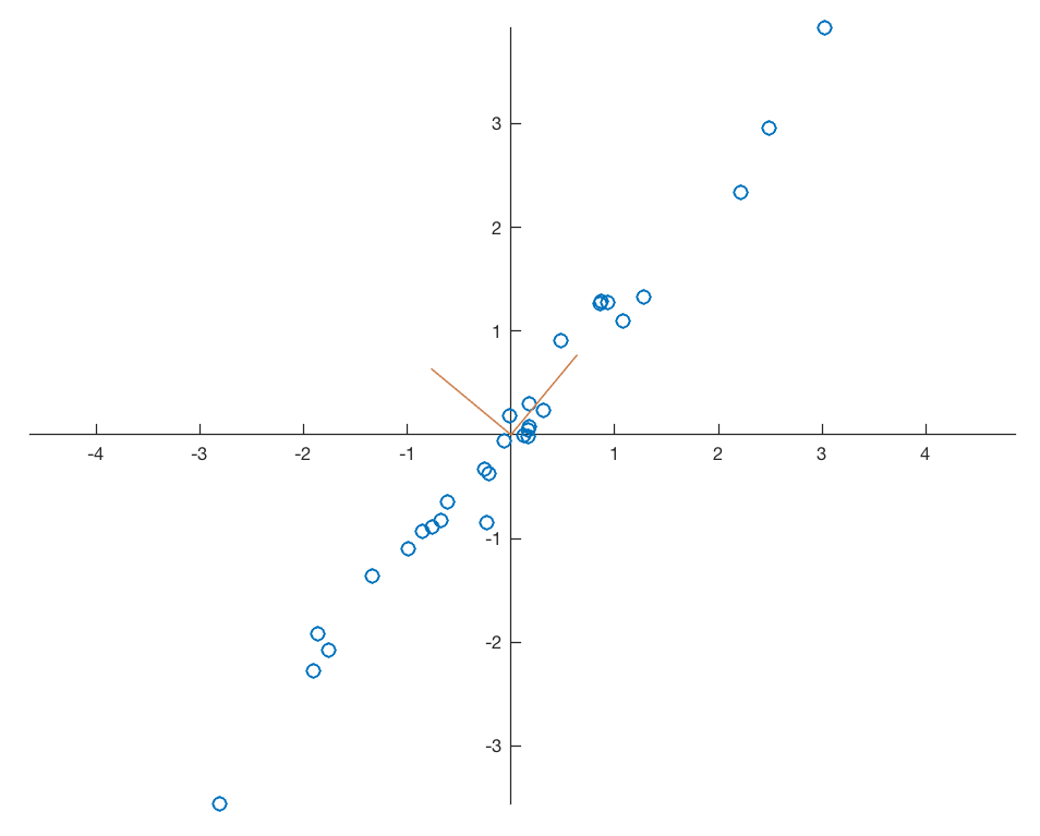
As you can see the second eigenvalue of 2.0453 is larger than the first eigenvalue of 0.0172. Therefore we need to change the order of the new variables in newdata after the transformation. Display the data together with the eigenvectors representing the new coordinate system.
plt.figure()
plt.plot(data[:,0],data[:,1],
   marker='o',
   linestyle='none')
plt.plot((0,V[0,0]),(0,V[1,0]),
color=(0.8,0.5,0.3),
linewidth=0.75)
plt.text(V[0,0],V[1,0],'PC2',
color=(0.8,0.5,0.3))
plt.plot((0,V[0,1]),(0,V[1,1]),
color=(0.8,0.5,0.3),
linewidth=0.75)
plt.text(V[0,1],V[1,1],'PC1',
color=(0.8,0.5,0.3))
ax = plt.gca()
ax.spines['top'].set_color('none')
ax.spines['right'].set_color('none')
ax.spines['left'].set_position('zero')
ax.spines['bottom'].set_position('zero')
plt.axis(np.array([-6,6,-4,4]))
plt.xlabel('x-value')
plt.ylabel('y-value')
plt.show()
The eigenvectors are unit vectors and orthogonal, therefore the norm is one and the inner (scalar, dot) product is zero.
print(linalg.norm(V[:,0]))
print(linalg.norm(V[:,1]))
print(np.dot(V[:,0],V[:,1]))
which yields
0.9999999999999999
0.9999999999999999
0.0
Step 4
Calculating the data set in the new coordinate system. We need to flip newdata left/right since the second column is the one with the largest eigenvalue by typing
newdata = np.matmul(data,V)
newdata = np.fliplr(newdata)
print(newdata)

print(np.var(newdata[:,0],ddof=1))
print(np.var(newdata[:,1],ddof=1))
which yields
newdata =

[[-0.28687857 -0.06796136]
[-0.98110732 -0.13692354]
[ 0.42153266 0.18529491]
[-2.11734482 -0.00967294]
[ 0.89395125 -0.01241517]
[ 0.85585602 -0.08631932]
[ 3.23801307 0.06391048]
[ 1.59265288 0.08944404]
(cont'd)
Step 5
The eigenvalues of the covariance matrix (the diagonals of the diagonalized covariance matrix) indicate the variance in this (new) coordinate direction. We can use this information to calculate the relative variance for each new variable by dividing the variances according to the eigenvectors by the sum of the variances. In our example, the 1st and 2nd principal component contains 99.17 and 0.83 percent of the total variance in data.
print(np.var(newdata[:,0],ddof=1))
print(np.var(newdata[:,1],ddof=1))

print(np.var(newdata[:,0],ddof=1)/
(np.var(newdata[:,0],ddof=1)+ \
np.var(newdata[:,1],ddof=1)))
print(np.var(newdata[:,1],ddof=1)/
(np.var(newdata[:,0],ddof=1)+ \
np.var(newdata[:,1],ddof=1)))
which yields
2.045340567485195
0.017204658450711223
0.9916585303273026
0.008341469672697424
Alternatively we get the variances by normalizing the eigenvalues:
variance = D / np.sum(D)
print(variance)
which yields
[0.00834147 0.99165853]
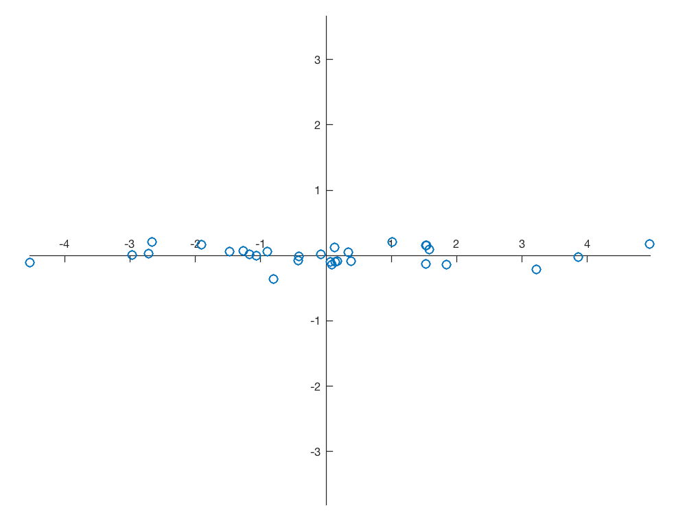
and therefore again 99.17% and 0.83% of the variance for the two principal components. Display the newdata together with the new coordinate system.
plt.figure()
plt.plot(newdata[:,0],newdata[:,1],
marker='o',
linestyle='none')
ax = plt.gca()
ax.spines['top'].set_color('none')
ax.spines['right'].set_color('none')
ax.spines['left'].set_position('zero')
ax.spines['bottom'].set_position('zero')
plt.axis(np.array([-6,6,-4,4]))
plt.xlabel('PC1',loc='right')
plt.ylabel('PC2',loc='top')
plt.show()
Do the same experiment using the MATLAB function pca. We get same values for newdata and variance.
pca = PCA(n_components=2)
pca.fit(data)
print(pca.components_)
print(pca.explained_variance_ratio_)
newdata = pca.transform(data)
print(newdata)
which yields
[[-0.66741275 -0.744688 ]
[-0.744688 0.66741275]]

[0.99165853 0.00834147]

[[-0.28687857 -0.06796136]
[-0.98110732 -0.13692354]
[ 0.42153266 0.18529491]
[-2.11734482 -0.00967294]
[ 0.89395125 -0.01241517]
[ 0.85585602 -0.08631932]
[ 3.23801307 0.06391048]
[ 1.59265288 0.08944404]
(cont'd)
The new data are decorrelated.
r = np.corrcoef(newdata[:,0],newdata[:,1])
print(r[0,1])
which yields
-5.385152103520556e-16
Step 6
Now you are ready for a cup of good south Ethiopian coffee! A more detailed version of the description of the Python code and more examples can be found in the new Python Recipes for Earth Sciences book (Trauth 2022).

References
Pearson, K. (1901) On Lines and Planes of Closest Fit to Systems of Points in Space. Philosophical Magazine. 2 (11): 559–572.
Hotelling, H. (1933) Analysis of a complex of statistical variables into principal components. Journal of Educational Psychology, 24, 417–441, and 498–520.
Hotelling, H. (1936) Relations between two sets of variates. Biometrika, 28, 321–377.
Trauth, M.H. (2022) Python Recipes for Earth Sciences – First Edition. Springer International Publishing, 453 p., Supplementary Electronic Material, Hardcover, ISBN 978-3-031-07718-0.
Wikipedia (2017) Article on Principal Component Analysis, Weblink.