Sediment data is typically display in diagrams with two axes, a core depth axis and an age axis. Here is a MATLAB script to convert depths into ages and display a sediment parameter in a diagram with both age and depth axis.
First, we create a synthetic data set of a sine wave with a period of 200.
clear, clc, close all
t = 0 : 650;
rec = 0.5*sin(2*pi*t/200) + 0.5;
Then we load the age depth conversion table contained in the file tiepoints.txt.
tiepoints = load('tiepoints.txt');
We can display the relationship between age and depth in an age-depth plot by typing
figure('Position',[100 800 500 500],...
   'Color',[1 1 1])
axes('Position',[0.2 0.2 0.7 0.7],...
   'XLim',[0 700],...
   'YLim',[0 400],...
   'YDir','Reverse',...
   'Box','On',...
   'FontSize',14)
line(tiepoints(:,2),tiepoints(:,1),...
   'LineWidth',1,...
   'LineStyle','None',...
   'Marker','o')
xlabel('Age (kyr BP)')
ylabel('Depth in Core (m)')
Next, we interpolate this relationship to an evenly-spaced age scale.
age = 0 : 50 : 650; age = age';
ageint = interp1(tiepoints(:,2),tiepoints(:,1),...
age,'linear');

depthintlabels = num2str(ageint,'%3.0f\n');
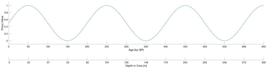
and display in a first diagram with two axes.
figure1 = figure('Position',[100 500 1800 600],...
   'Color',[1 1 1]);
ax(1) = axes('Position',[0.1 0.4 0.8 0.4],...
   'Color','None',...
   'XLim',[0 650],...
   'YLim',[-0.1 1.1],...
   'XTick',0:50:650,...
   'YLim',[-0.1 1.1],...
   'FontSize',14);
line1 = line(t,rec,...
   'LineWidth',1);
xlabel(ax(1),'Age (kyr BP)')
ylabel(ax(1),'Proxy Value')
ax(2) = axes('Position',[0.1 0.25 0.8 0.4],...
   'Color','None',...
   'XLim',[0 650],...
  'XTickMode','Manual',...
   'XTick',0:50:650,...
   'XTickLabels',depthintlabels,...
   'YLim',[0 1],...
   'YTick',[],...
   'YColor','None',...
   'FontSize',14);
xlabel(ax(2),'Depth in Core (m)')
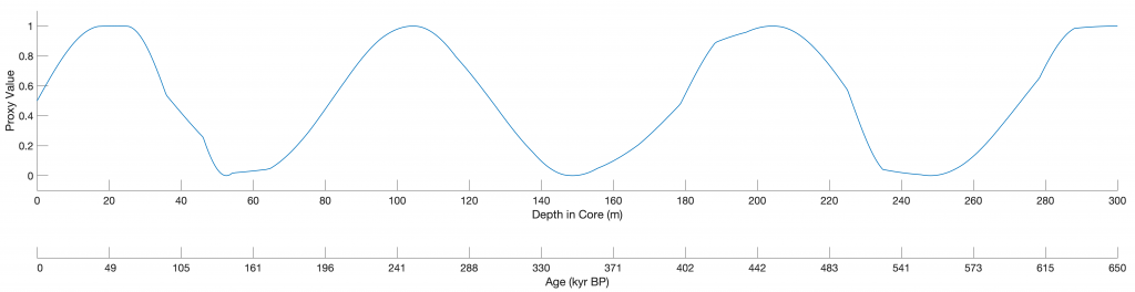
Then we interpolate the ages to an evenly-spaced depth scale
d = interp1(tiepoints(:,2),tiepoints(:,1),t,...
   'linear');

depth = 0 : 20 : 300; depth = depth';
depthint = interp1(tiepoints(:,1),tiepoints(:,2),...
   depth,'pchip');

ageintlabels = num2str(depthint,'%3.0f\n');
and again display in a first diagram with two axes.
figure1 = figure('Position',[100 100 1800 600],...
   'Color',[1 1 1]);
ax(1) = axes('Position',[0.1 0.4 0.8 0.4],...
   'Color','None',...
   'XLim',[0 300],...
   'XTick',0:20:300,...
   'YLim',[-0.1 1.1],...
   'FontSize',14);
line1 = line(d,rec,...
   'LineWidth',1);
xlabel(ax(1),'Depth in Core (m)')
ylabel(ax(1),'Proxy Value')
ax(2) = axes('Position',[0.1 0.25 0.8 0.4],...
   'Color','None',...
   'XLim',[0 300],...
   'XTick',0:20:300,...
   'XTickMode','Manual',...
   'XTickLabels',ageintlabels,...
   'YLim',[0 1],...
   'YTick',[],...
   'YColor','None',...
   'FontSize',14);
xlabel(ax(2),'Age (kyr BP)')
References
Trauth, M.H. (2014) A new probabilistic technique to build an age model for complex stratigraphic sequences. Quaternary Geochronology, 22, 65–71, https://doi.org/10.1016/j.quageo.2014.03.001.