Most methods of time series analysis require evenly spaced time axes, which is why we have to convert unevenly spaced time series into a time series with an evenly spaced time axis using interpolation.
Numerous methods exist for interpolating unevenly spaced sequences of data or time series. Linear interpolation predicts the x-values by drawing a straight line between two neighboring measurements and calculating the x-value at the appropriate point along the line. However, this method has its limitations because it assumes linear transitions in the data, which introduces a number of artifacts (including the loss of high-frequency components of the signal) and limits the data range to that of the original measurements. Alternatively, nearest-neighbor interpolation simply selects the value of the nearest measurement without including the values of other measurements in any calculation. The method is very simple, in fact no new values need to be calculated. Therefore, the method is much faster than all other methods, and therefore for very large data sets (e.g., long time series, large spatial data sets and images) but produces a very angular result, but produces a very angular result.
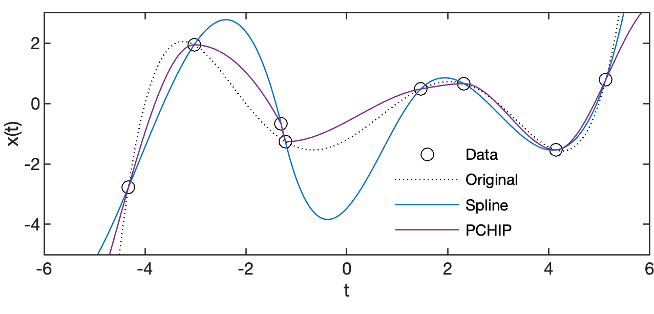
Cubic spline interpolation is another method for interpolating data that are unevenly spaced. Cubic splines are piecewise continuously differentiable curves that require at least four data points for each step. An advantage of the method is that it preserves the high-frequency information contained in the data. However, steep gradients in the data sequence–which typically occur adjacent to extreme minima and maxima–could cause spurious amplitudes in the interpolated time series. A variant that solves this problem is the piecewise cubic Hermite interpolating polynomial (PCHIP) named after French mathematician Charles Hermite (1822–1901) (Fritsch and Carlson 1980). The interpolated values are determined by shape-preserving piecewise cubic interpolation which avoids spurious amplitudes in the interpolated time series. This is achieved by waiving the piecewise continuous differentiability, that is abrupt changes in direction are accepted (e.g. near the neighboring measurement at –1.215 and –1.3 in the figure below), so that the curves between the measurements are always monotonous (increasing or decreasing) (e.g. between –1.3 and –1.4688 in the figure below). Since all these (and other) interpolation techniques might introduce artifacts to the data, it is always advisable (1) to keep the total number of data points constant before and after interpolation, (2) to report the method employed for estimating the evenly spaced data sequence, and (3) to explore the effect of interpolation on the variance of the data.
After this short introduction, we can demonstrate these four main methods with a simple example. After clearing the workspace and storing the standard color order of MATLAB in colors to display the interpolation results in a plot, we generate a synthetic time series x1 from the values of a 5th degree polynomial with the zeros +5, –4, +3, –2, and +1 by typing
clear, clc, close all

colors = colororder;

t1 = -20 : 0.1 : 20;
x1 = 0.01*(t1-5).*(t1+4).*(t1-3).*(t1+2).*(t1-1);
The time series x1 has a rather high resolution, namely one value each along the time axis t1 running from –20 to +20, with 0.01 intervals. However, this high resolution is mainly needed for graphical representation. Our actual measured values x2, which follow the 5th degree polynomial, are taken from a random, unevenly spaced series of time values t2.
rng(0)
t2 = [
   -4.3254
   -3.0246
   -1.2150
   -1.3000
    1.4688
    2.3236
    4.1472
    5.1338
];
x2 = interp1(t1,x1,t2);
We pretend we don’t know the underlying function (i.e., the 5th degree polynomial), but try to estimate it using linear, nearest-neighbors and spline interpolation. To do this, we first create (for the purpose of graphing) a time axis t3 between –6 and +6, with 0.05 intervals. We then use interp1 with the three methods linear, nearest and spline by typing
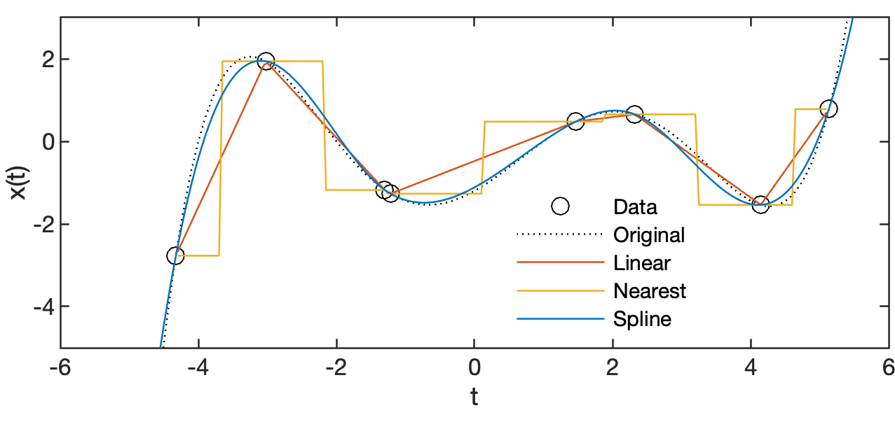
t3 = -6 : 0.05 : 6;
x3L = interp1(t2,x2,t3,'linear');
x3N = interp1(t2,x2,t3,'nearest');
x3S = interp1(t2,x2,t3,'spline');
By default, the linear and nearest neighbour methods do not extrapolate. The missing values on either side of the measured values are filled with NaN. We can compare the interpolation results in a plot using
plot(t1,x1,'k:'), hold on
plot(t2,x2,'ko')
plot(t3,x3L,'Color',colors(2,:))
plot(t3,x3N,'Color',colors(3,:))
plot(t3,x3S,'Color',colors(1,:)), hold off
axis([-6 6 -5 3])
Comparing the interpolation results with the original polynomial, we see that the linear interpolation connects the measurements by the shortest path and the nearest-neighbour interpolation takes the value of the next measured value. The spline interpolation describes the polynomial well with a very smooth curve. However, if we change the x-value of the second of the two very closely adjacent measurements -1.2150 and -1.300 by +0.5, that is we add a small measurement error, we observe the undesirable effect of the spline method described above: Steep gradients in the data sequence cause spurious amplitudes in the interpolated time series. Alternatively, we can use the pchip method instead that performs a shape-preserving piecewise cubic interpolation. Typing
x2(4,1) = x2(4,1)+0.5;
x3S = interp1(t2,x2,t3,'spline');
x3C = interp1(t2,x2,t3,'pchip');

plot(t1,x1,'k:'), hold on
plot(t2,x2,'ko')
plot(t3,x3S,'Color',colors(1,:))
plot(t3,x3C,'Color',colors(4,:)), hold off
axis([-6 6 -5 3])
changes x2(4,1), interpolates the data using spline and pchip interpolation and displays the result in a plot.
References
Fritsch FN, Carlson RE (1980) Monotone Piecewise Cubic Interpolation. SIAM Journal on Numerical Analysis 17:238–246
Trauth, M.H. (2025) MATLAB Recipes for Earth Sciences – Sixth Edition. Springer International Publishing, 567 p, https://doi.org/10.1007/978-3-031-57949-3.
Trauth, M.H. (2024) Python Recipes for Earth Sciences – Second Edition. Springer International Publishing, 491 p., https://doi.org/10.1007/978-3-031-56906-7.