
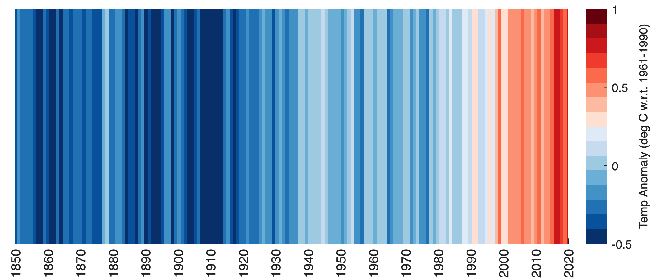
Ed Hawkins, climatologist at U Reading, published a visualization graphics for climate data to display global warming. Here’s a script to display the warming stripes with MATLAB.
To display the popular warming stripes, Python scripts and R scripts exist, but I was not able to find a MATLAB script, inspired by a discussion on Twitter. In following script I used the HadCRUT.4.6.0.0 dataset by the Met Office Hadley Centre. The hex colormap was taken from the Python script and converted to RGB colors using a script by Jos van der Geest published on the MathWorks File Exchange.
We first clear the workspace, clear the Command Window and close all Figure Windows. We then load the dataset and define the time interval.
clear; clc; close all
data = load('HadCRUT.4.6.0.0.annual_ns_avg.txt');
ticks = 1850:2022;
ticksloc = 1850:10:2022;
We then create a colormap. These are the colors from the Python script cited above, converted with Jos van der Geest’s MATLAB code to RGB colors, and then simply stored in the variable wscolors.
wscolors = [
   0.0314 0.1882 0.4196
   0.0314 0.3176 0.6118
   0.1294 0.4431 0.7098
   0.2588 0.5725 0.7765
   0.4196 0.6824 0.8392
   0.6196 0.7922 0.8824
   0.7765 0.8588 0.9373
   0.8706 0.9216 0.9686
   0.9961 0.8784 0.8235
   0.9882 0.7333 0.6314
   0.9882 0.5725 0.4471
   0.9843 0.4157 0.2902
   0.9373 0.2314 0.1725
   0.7961 0.0941 0.1137
   0.6471 0.0588 0.0824
   0.4039 0 0.0510
];
Finally, we create the graphics using imagesc. We first create a landscape Figure Window with white background. We then create axes with the time axes as defined above, e.g. running from 1970 to 2022, rotate the tick labels of the x-axis by 90 degrees, and display annual tick labels. We also hide the tick labels of the y-axis. Then use imagesc to display the stripes and the colormap wscolors.
figure('Position',[100 100 800 300],...
   'Color',[1 1 1])
axes(...
   'XLim',[1850 2020],...
   'XTickMode','manual',...
   'XTick',ticksloc,...
   'XTickLabelRotation',90,...
   'YTick',[])
imagesc('XData',ticks',...
   'YData',[0 1],...
   'CData',data(:,2)')
clim([-0.5 1])
colormap(wscolors)
c = colorbar;
c.Label.String = ...
   'Temp Anomaly (deg C w.r.t. 1961-1990)';
References
Hawkins, Ed (2018-12-04). “2018 visualisation update / Warming stripes for 1850–2018 using the WMO annual global temperature dataset”. Climate Lab Book.