There is disagreement among scientists as to whether graphics should be presented in an attractive design or whether the standard design of the statistical software is sufficient. Here is a comparison of a graphic as generated by MATLAB with an improved design.
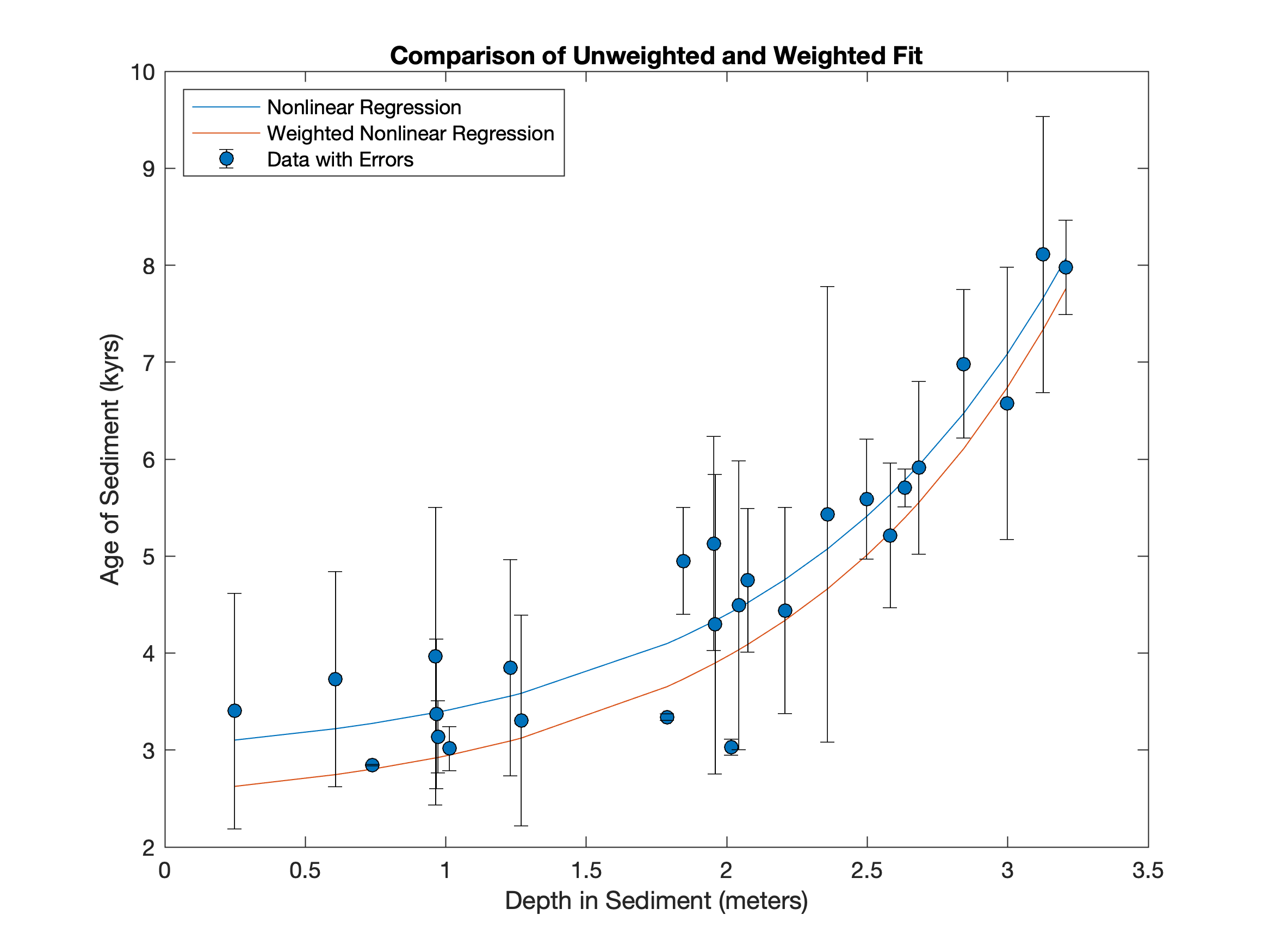
The data was generated in an older post Create Publishable Graphics with MATLAB, Part 1 and can be downloaded here. First, we create a graphic as it is generated with standard MATLAB settings. All elements are clearly visible, the graphics are functional – but not beautiful.
plot(data(:,1),fittedcurve_1,...
data(:,1),fittedcurve_2);
hold on
errorbar(...
data(:,1),data(:,2),data(:,3),...
   'Marker','o',...
   'MarkerEdgeColor',[0 0 0],...
   'MarkerFaceColor',[0 0.4453 0.7383],...
   'Color',[0 0 0],...
   'LineStyle','none')
xlabel(...
   'Depth in Sediment (meters)');
ylabel1 = ylabel(...
   'Age of Sediment (kyrs)');
title1 = title(...
   'Comparison of Unweighted and Weighted Fit');
legend1 = legend('Nonlinear Regression',...
   'Weighted Nonlinear Regression',...
   'Data with Errors',...
   'Location','Northwest');

print -depsc2 -cmyk figure_vs1.eps
print -dpng -r300 figure_vs1.png
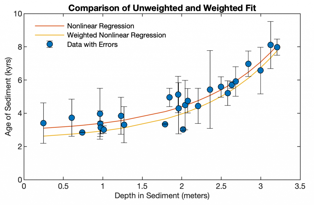
Now we use MATLAB’s ability to modify all graphic objects, such as line thickness, font sizes, and colors, , to create a publishable graphic.
figure1 = figure(...
   'Position',[200 200 800 600],...
   'Color',[1 1 1]);
axes1 = axes(...
   'Box','on',...
   'XLim',[0 3.5],...
   'YLim',[0 10],...
   'Units','Centimeters',...
   'Position',[2 2 10 6],...
   'LineWidth',0.6,...
   'FontName','Helvetica',...
   'FontSize',8);
hold on
errorbar1 = errorbar(...
   data(:,1),data(:,2),data(:,3),...
   'Marker','o',...
   'MarkerEdgeColor',[0 0 0],...
   'MarkerFaceColor',[0 0.4453 0.7383],...
   'Color',[0 0 0],...
   'LineStyle','none');
line1 = line(data(:,1),fittedcurve_1,...
   'LineWidth',0.75,...
   'Color',[0.8477 0.3242 0.0977]);
line2 = line(data(:,1),fittedcurve_2,...
   'LineWidth',0.75,...
   'Color',[0.9258 0.6914 0.1250]);
xlabel1 = xlabel(...
   'Depth in Sediment (meters)',...
   'FontName','Helvetica',...
   'FontSize',8);
ylabel1 = ylabel(...
   'Age of Sediment (kyrs)',...
   'FontName','Helvetica',...
   'FontSize',8);
title1 = title(...
   'Comparison of Unweighted and Weighted Fit',...
  'FontName','Helvetica',...
   'FontSize',9);
legend1 = legend('Nonlinear Regression',...
   'Weighted Nonlinear Regression',...
   'Data with Errors',...
   'Location','Northwest');
legend1.Box = 'off';

print -depsc2 -cmyk figure_vs2.eps
print -dpng -r300 figure_vs2.png
The second graphic is undoubtedly more beautiful, but is the effort really necessary?