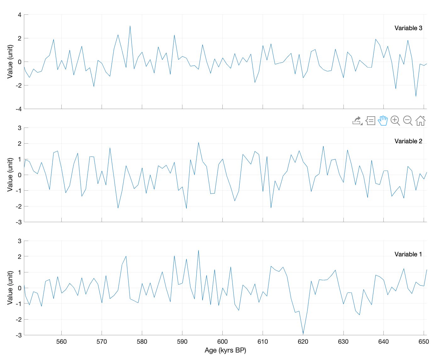
When paleoclimatologists work with multiproxy data, they often have to display many variables in multiple axes, and then to zoom and browse through individual sections of the data series. Here is a MATLAB script that demonstrates how to link axes for zooming and paning.
First we create a synthetic data set using random numbers and variables names.
clear, clc, close all

age = 1 : 1000;
data = randn(1000,3);
datastr = [...
   "Variable 1";
   "Variable 2";
   "Variable 3"];
Then we create a figure window.
f(1) = figure('Position',[200 300 800 600],...
   'Color',[1 1 1]);
Next we display three individual axes to display three data series. Axes a(i), not visible in the figure window, are used to place text t(i) that is not moved when zooming and paning the data set. The data set is displayed as a line l(i) in the axes system b(i). Finally we use xlabel and ylabel to place labels next to the axes.
for i = 1 : 3
   a(i) = axes('Position',...
      [0.1 0.1+0.3*(i-1) 0.8 0.25],...
      'Visible','Off');
   t(i) = text(0.99,0.9,datastr(i,:),...
      'HorizontalAlignment','Right',...
      'VerticalAlignment','Top');
   b(i) = axes('Position',...
      [0.1 0.1+0.3*(i-1) 0.8 0.25],...
      'YLim',[-4 4],...
      'XGrid','On',...
      'YGrid','On',...
      'Color','None');
   l(i) = line(age,data(:,i));
   xl(i) = xlabel('Age (kyrs BP)');
   yl(i) = ylabel('Value (unit)');
end
We then remove the ticks and axis labels ot the axes except for the one at the bottom of the figure window.
set(b(2:end),'XTickLabel',[])
set(xl(2:end),'Visible','Off')
Now we link the axes.
linkaxes(b,'x')
Then we make sure that the data are neither zoomed nor paned in y direction.
z(1) = zoom(f(1));
set(z(1),'Motion','horizontal');
p(1) = pan(f(1));
set(p(1),'Motion','horizontal');
Now we can use the zoom and pan tools of the axes to browse the data set.
Update: Carlos Sanchis, engineer at MathWorks, just informed me on Twitter that the function stackedplot does similar things – thank you, Carlos! Here is the code:
f(2) = figure('Position',[900 300 600 400],...
   'Color',[1 1 1]);
s(2) = stackedplot(data);
You can now zoom and pan across the x-values. Hovering over a location displays the y-values for each plot.