Industrial-organizational psychologist Mike Morrison is currently attracting a lot of attention on Twitter (#betterposters) and on YouTube where he suggests to create better science posters. He also provides templates for posters OSF. He basically complains about wall-of-text posters that he finds at conferences and suggests to use most of the poster area to include a colored rectangle with a central statement or conclusion. Here are my thoughts on the better poster movement.
It’s true, many conference posters have a lot of text, sometimes in the amount you would expect in a scientific paper rather than on a poster. You will often find tables and complicated equations on posters, but comparatively few photos and graphics. If such a poster hangs in a poster session, it is often ignored, except by the absolute specialists in the field of posters. Since the problem is recognized by many colleagues, Mike hits the bull’s eye when he suggests an alternative design. His templates look basically the same as most posters. There is an introduction, the methods, the results and a discussion, together with tables and figures.
The only really new thing is that Mike uses most of the poster’s area to place a colored area with a central conclusion or statement. With this he has undoubtedly achieved two things: first, one can very quickly capture the result of the scientific study, and secondly, by taking up smaller space for the rest of the poster he reduces the text. A third goal, increased attention due to the unusual poster design, is likely to decrease quite quickly due to the current popularity of design at conferences. Possibly the participants of conferences simply get tired of the new idea. Many of his other ideas are actually not new, for example QR codes have been copied to posters earlier to create a link between the poster and the author’s webpage.
After I wrote a short commend on Twitter on #betterposter I was interviewed by Colleen Flaherty, Faculty Correspondent of InsideHigherEd.com about it. There I said that posters are teaser to attract people that are not exactly working in our area. The ones that possibly help you to move forward, because they have some overlapping knowledge and interest. Posters need to be beautiful, with a very short and attractive, meaningful title, something like the main conclusion of the #betterposter design.
You stand next to the poster, smiling, and you start communicating with your possible future collaborator. But if you’re not there, the poster should also work. That’s why we need content, but not too much, nice and simple. Therefore I support a movement toward better posters, in principle. However, the #betterposter design wastes too much space on a central statement and there is not enough space for real content.
Therefore Mike correctly recognizes the problem, but the solution is wrong, as many of the user examples show, which are discussed on Twitter. Some scientists manage not to place too much information to the right and left of the central statement, but those were probably the ones who didn’t make overloaded posters before. That probably wasn’t what Mike wanted to achieve, but he’s too nice to criticize his fans!
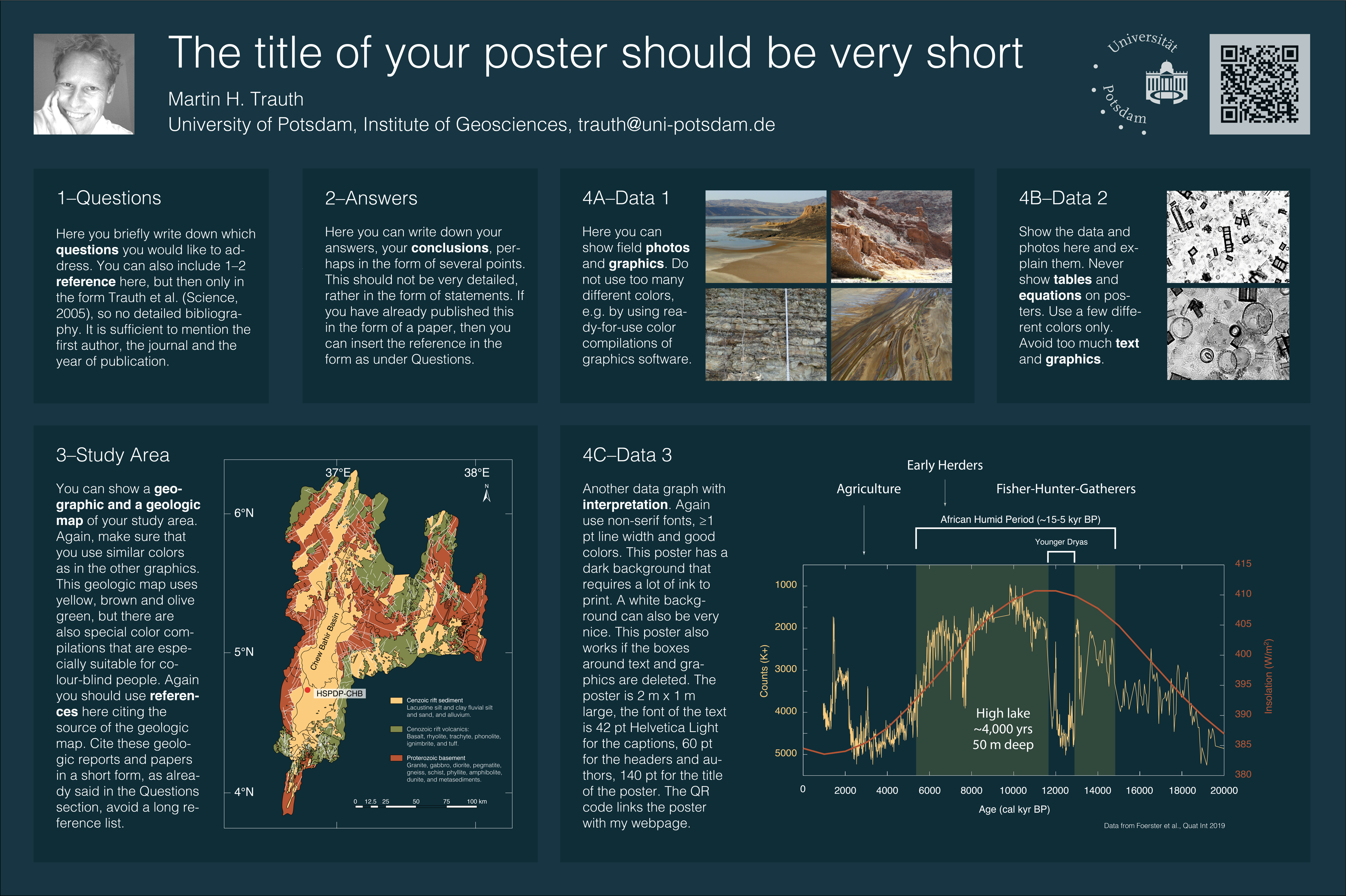
In my MDRES textbook on science communication, together with designer Elisabeth Sillmann and in its 2nd edition since last year, I gave suggestions for the design of posters six years ago. In its chapter “Creating Conference Posters” we say that “The most common mistake with posters is to include too much information, too many figures, and too much text.”. Then we demonstrate how to plan and design a poster and provide a very simply template, using graphics that were created within the book.
The design of our template included in the book is not particularly attractive. It is simple and only serves to explain the principle of the poster. A lot has changed since the first edition of the MDRES book, for example in the colors, the fonts that are used and that boxes no longer have rounded corners – if there are any boxes at all! MATLAB has even replaced the standard colormap JET with PARULA after many years. Milder colours are now in fashion, no longer the bright reds, greens and blues of the 80s.
Some of the thoughts behind the new poster template are explained in the captions, more ideas and rules can be found in the chapter about posters in the MDRES book. The relationship between text and images and the overall information content is the result of an attempt to create a poster that provides just enough information to function without talking to the author. On the other hand, it should not discourage potential visitors because it contains too much information.
Please send me an email, what you think about the poster. It is not perfect, can be further improved. It was created with Adobe Illustrator 2019 and has five layers: Background, Boxes, Graphics, Text and Title. You can use the PDF with whatever software you like and use the layers. Maybe I will put more posters online to give more suggestions.
Download poster template (950 KB).