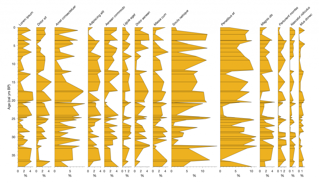
Palynologists traditionally use the software Tilia by late Eric Grimm to plot their data, which is also used by micropaleontologists. Here is a MATLAB script to create a diagram that is similar to the typical Tilia graphics.
The history of the development of my script goes back a few years, when a doctoral student asked about the software Tilia, developed by late Eric Grimm, former Director of Sciences of the Illinois State Museum (Jacobson & Grimm, 1986; Grimm, 1991). However, the student did not want to use the full catalogue of functions of the excellent software, but only to display their diatom counts, and therefore I hesitated to purchase the software. We first need to create some synthetic data. The first column contains the age vector, while all other data are uniformly-distributed pseudo random numbers. The total of all values within each column is 100. We can change the number of data points m.
clear, clc, close all
rng(10)
m = 40;
data(:,1) = sortrows(m*rand(m,1));
data(:,2:15) = rand(m,14);
data(:,2) = 5*data(:,2);
data(:,3) = 5*data(:,3);
data(:,4) = 10*data(:,4);
data(:,5) = 5*data(:,5);
data(:,6) = 5*data(:,6);
data(:,7) = 3*data(:,7);
data(:,8) = 5*data(:,8);
data(:,9) = 5*data(:,9);
data(:,10) = 15*data(:,10);
data(:,11) = 12*data(:,11);
data(:,12) = 5*data(:,12);
data(:,13) = 3*data(:,13);
data(:,14) = 2*data(:,14);
data(:,15) = 2*data(:,15);
data(1,1) = 0;
We also create a list of fossil names by typing
names = ["Lorem ipsum"
   "Dolor sit"
   "Amet consectetuer"
   "Adipiscing elit"
   "Aenean commodo"
   "Ligula eget"
   "Dolor aenean"
   "Massa cum"
   "Sociis natoque"
   "Penatibus et"
   "Magnis dis"
   "Parturient montes"
   "Nascetur ridiculus"
   "Mus donec"
   "Quam felis"
];
Alternatively, we can import any other data set with an arbitrary number of data points and variables, provided the total comes to 100%. We add an age of zero at both ends of the time series by typing
[m,n] = size(data);
data(2:m+1,:) = data;
data(1,:) = zeros(1,n);
data(1,1) = data(2,1);
data(m+2,:) = zeros(1,n);
data(m+2,1) = data(m+1,1);
The multiplot function first creates a figure window with the same size as the screen. It then plots all records at the same scale.
root1 = groot;
scrsz = root1.ScreenSize;
scrsz = 0.6*scrsz;
sf = 0.75;
colorcode = [0.8 0.8 0.4];
figure1 = figure(...
    'Position',[1 scrsz(4) scrsz(3) scrsz(4)],...
    'Color',[1 1 1]);
for i = 1:n-1
if i == 1
xcoord = max(data(:,2))/100;
axes1 = axes(...
    'Parent',figure1,...
    'YMinorTick','on',...
    'XMinorTick','on',...
    'TickDir','out',...
    'Position',[0.1 0.1 sf*xcoord 0.6],...
    'FontSize',12,...
    'XLim',[0 max(data(:,2))],...
    'YLim',[min(data(:,1)) max(data(:,1))],...
    'YDir','reverse',...
    'Box','off');
patch1 = patch(data(:,2),data(:,1),colorcode);
hold on
barh1 = barh(data(2:end-1,1),data(2:end-1,2),...
    'BarWidth',0,...
    'EdgeColor',[0 0 0],...
    'FaceColor',colorcode);
title1 = title(names(i),...
    'Rotation',45,...
    'FontWeight','normal',...
    'Position',[0 -1],...
    'HorizontalAlignment','left',...
    'VerticalAlignment','top',...
    'FontSize',12);
xlabel1 = ylabel('Age (cal yrs BP)');
ylabel1 = xlabel('%');
xcoord = xcoord + 0.01;
else
axes2 = axes(...
    'Parent',figure1,...
    'YTick',zeros(1,0),...
    'FontSize',12,...
    'YMinorTick','on',...
    'XMinorTick','on',...
    'TickDir','out',...
    'Position',[sf*xcoord+0.1 0.1 ...
    sf*max(data(:,i+1))/100 0.6],...
    'XLim',[0 max(data(:,i+1))],...
    'YLim',[min(data(:,1)) max(data(:,1))],...
    'YDir','reverse',...
    'Box','off');
 patch2 = patch(data(:,i+1),data(:,1),colorcode);
 hold on
 barh2 = barh(data(2:end-1,1),data(2:end-1,i+1),...
    'BarWidth',0,...
    'EdgeColor',[0 0 0],...
    'FaceColor',colorcode);
 xlabel2 = xlabel('%');
 title(names(i),...
    'Rotation',45,...
    'FontWeight','normal',...
    'FontAngle','italic',...
    'Position',[0 -1],...
    'HorizontalAlignment','left',...
    'VerticalAlignment','top',...
    'FontSize',12);
 xcoord = xcoord + max(data(:,i+1))/100 + 0.01;
end
end
We can change the multiplier for scrsz between 0 and 1 to match the figure size with the screen size. We can also change colorcode to modify the color of the patches. The variable sf scales the graph with respect to the figure window. Instead of a patch plot, the graphics function line for a line plot is also available. To use either of these we need to uncomment the patch or the line command by removing the % signs at the beginning of the corresponding lines.
References
Grimm EC. 1991. TILIA and TILIA⋅GRAPH computer programs. Springfield: Illinois State Museum.
Jacobson GL, Jr, Grimm EC. 1986. Numerical analysis of Holocene forest and prairie vegetation in central Minnesota. Ecology. 67(4):958–966.
Trauth, M.H., Sillmann, E. (2018) Collecting, Processing and Presenting Geoscientific Information, MATLAB® and Design Recipes for Earth Sciences – Second Edition. Springer Verlag, 274 p., https://doi.org/10.1007/978-3-662-56203-1