The new function heatmap was released with R2017a, providing a great way of displaying distance matrices in cluster analysis. Here I demonstrate how to modify the script of Chapter 9.5 of MRES.
As an exercise in performing a cluster analysis, the sediment data stored in sediments_3.txt are loaded. The function pdist provides many different measures of distance, such as the Euclidian or Manhattan (or city block) distance. We use the default setting which is the Euclidian distance.
clear
data = load('sediments_3.txt');
Y = pdist(data);
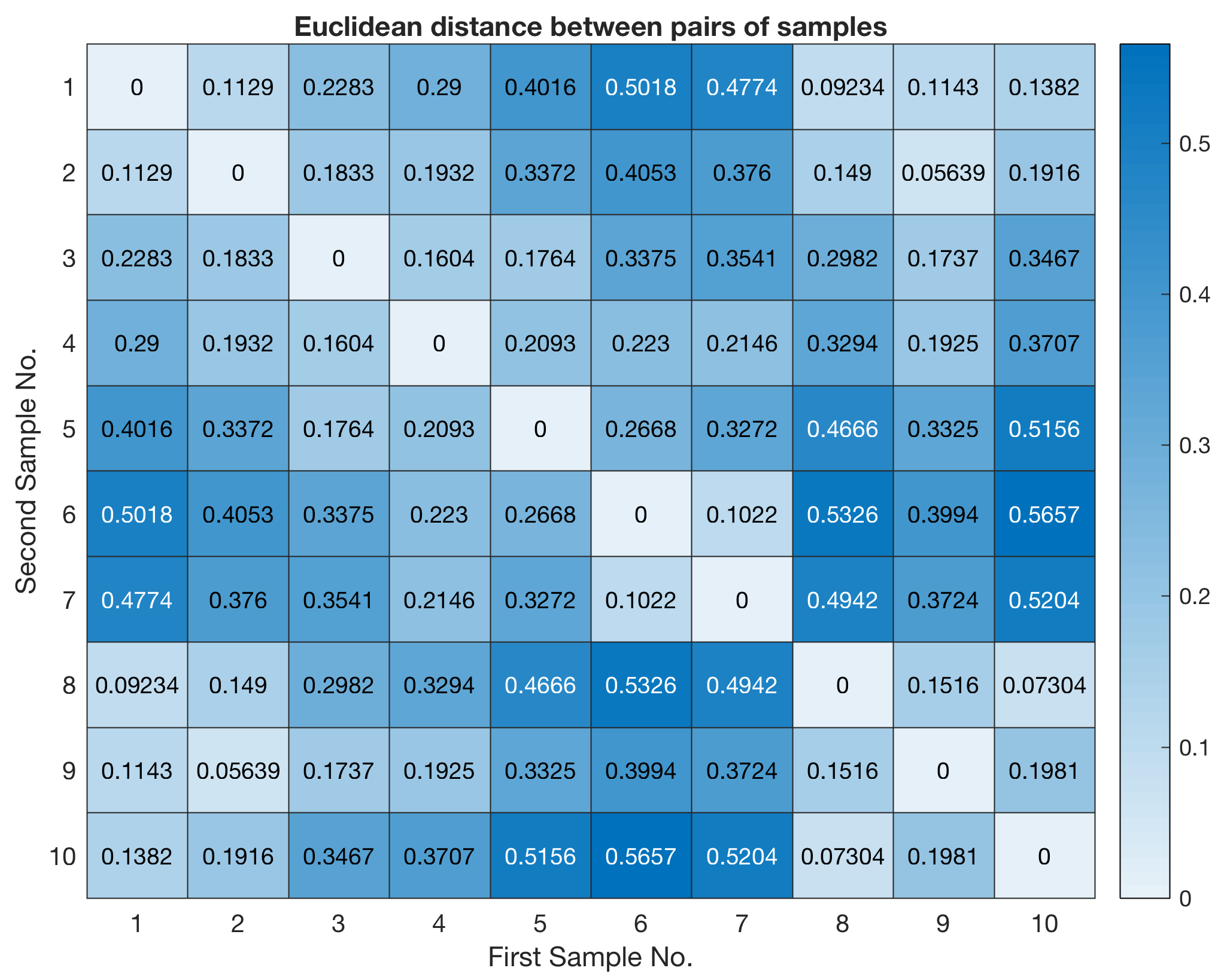
The function pdist returns a vector Y containing the distances between each pair of observations in the original data matrix. We can visualize the distances in a pseudocolor plot.
imagesc(squareform(Y)), colormap(hot)
title('Euclidean distance between pairs of samples')
xlabel('First Sample No.')
ylabel('Second Sample No.')
colorbar
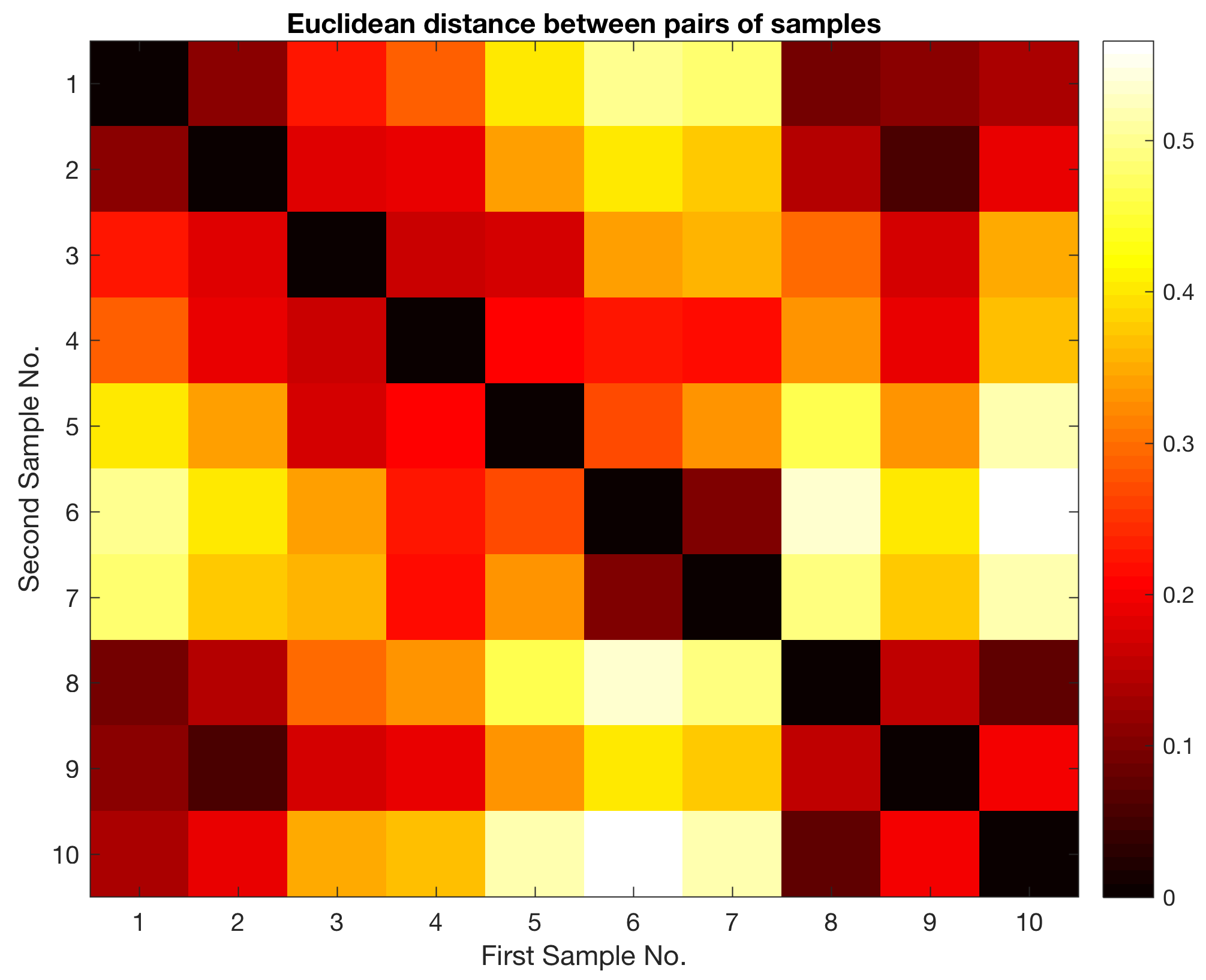
Alternatively, we can use the new function heatmap released with MATLAB R2017a. According to Wikipedia, a heatmap is a graphical representation of data where the individual values contained in the array are represented as colors.
heatmap(squareform(Y))
title('Euclidean distance between pairs of samples')
xlabel('First Sample No.')
ylabel('Second Sample No.')
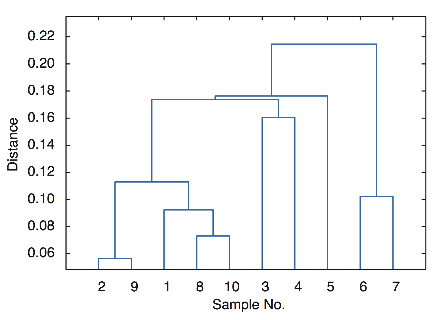
The function squareform converts Y into a symmetric, square format, so that the elements (i,j) of the matrix denote the distance between the i and j objects in the original data. We next rank and link the samples with respect to the inverse of their separation distances using the function linkage
Z = linkage(Y)
which yields
Z =
  2.0000  9.0000 0.0564
  8.0000 10.0000 0.0730
  1.0000 12.0000 0.0923
  6.0000  7.0000 0.1022
 11.0000 13.0000 0.1129
  3.0000  4.0000 0.1604
 15.0000 16.0000 0.1737
  5.0000 17.0000 0.1764
 14.0000 18.0000 0.2146
In this 3-column array Z, each row identifies a link. The first two columns identify the objects (or samples) that have been linked, while the third column contains the separation distance between these two objects, i.e. the values display in the heatmap. Finally, we visualize the hierarchical clusters as a dendrogram.
dendrogram(Z);
xlabel('Sample No.')
ylabel('Distance')
box on
More details about cluster analysis can be found in Chapter 9.5 of MRES.